Overview
For a client project, I worked on a pharmaceutical website that needed a patient-focused redesign. I led the UX process from early wireframes to high-fidelity mockups, ensuring every element supported clear and accessible treatment information. Using Hotjar to analyze real user behavior, I identified pain points and areas of success, which directly guided my design decisions. The final solution delivered a more intuitive, user-centered experience, helping patients access critical information with confidence. This case study highlights the end-to-end process, from research and insights to a fully realized, client-approved solution.
Role: UX Designer (Wireframes, Mockups, UX Strategy)
Tools: HotJar, Figma
Timeline: 7 months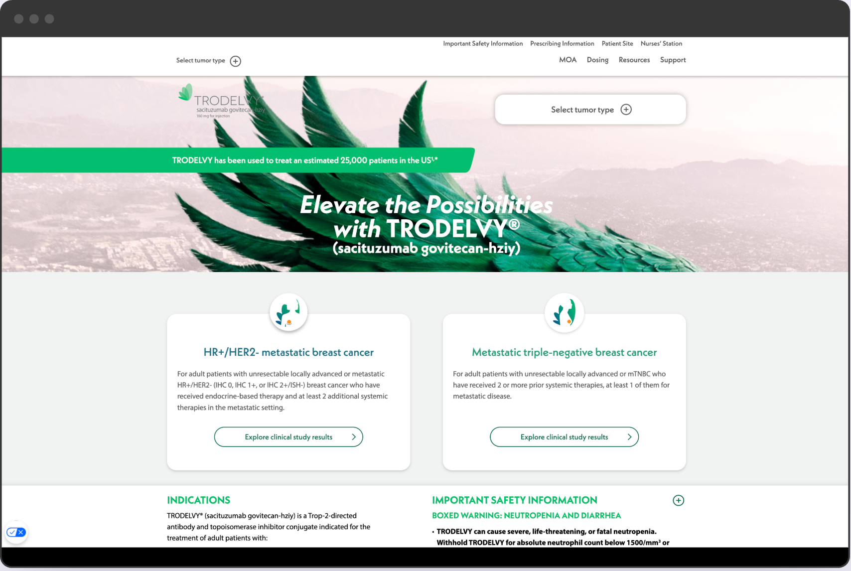
Snapshots of the live website
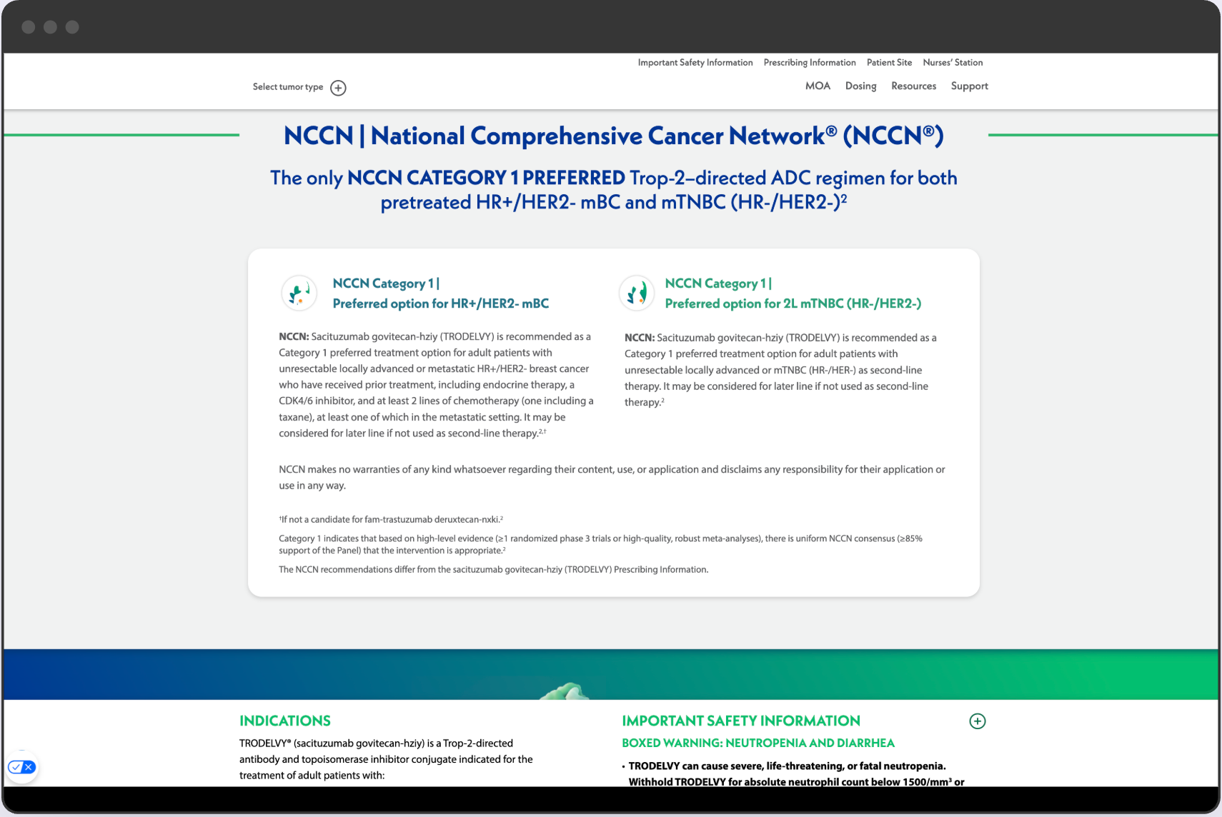
Snapshots of the live website
Problem Statement
The website contained critical treatment information, but users often struggled to find what they needed. Navigation was complex, and some content was dense and difficult to read. The challenge was to simplify the user journey and ensure patients could access reliable information quickly.
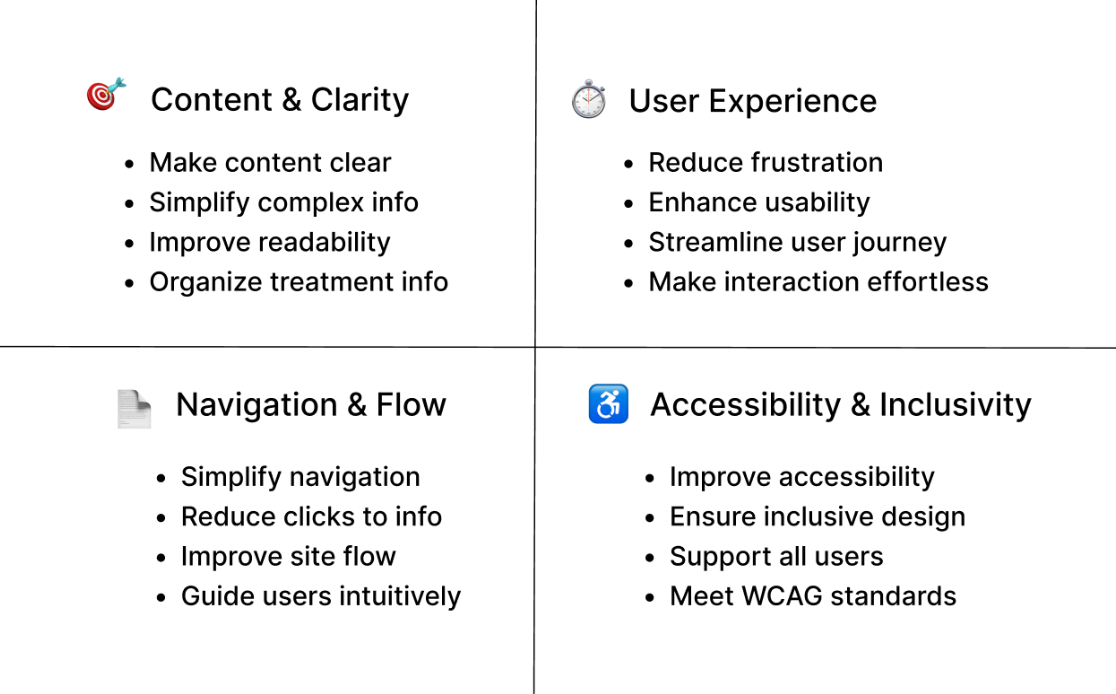
Goals and Success Metrics
- Simplify site navigation and information hierarchy
- Improve clarity of treatment information
- Increase user engagement and reduce frustration
- Ensure accessibility and readability for all users
Research and Insights
I analyzed user behavior on the existing site using Hotjar session recordings and engagement data. Key findings included:
1) Heavy drop off on text heavy pages
Users struggled with long paragraphs and often exited before scrolling.
Users struggled with long paragraphs and often exited before scrolling.
2) Confusing navigation labels
Ambiguous wording caused users to take unnecessary steps to find information.
Ambiguous wording caused users to take unnecessary steps to find information.
3) Need for quick access to key content
Users consistently looked for fast pathways to treatment details, FAQs, and resource pages.
Users consistently looked for fast pathways to treatment details, FAQs, and resource pages.
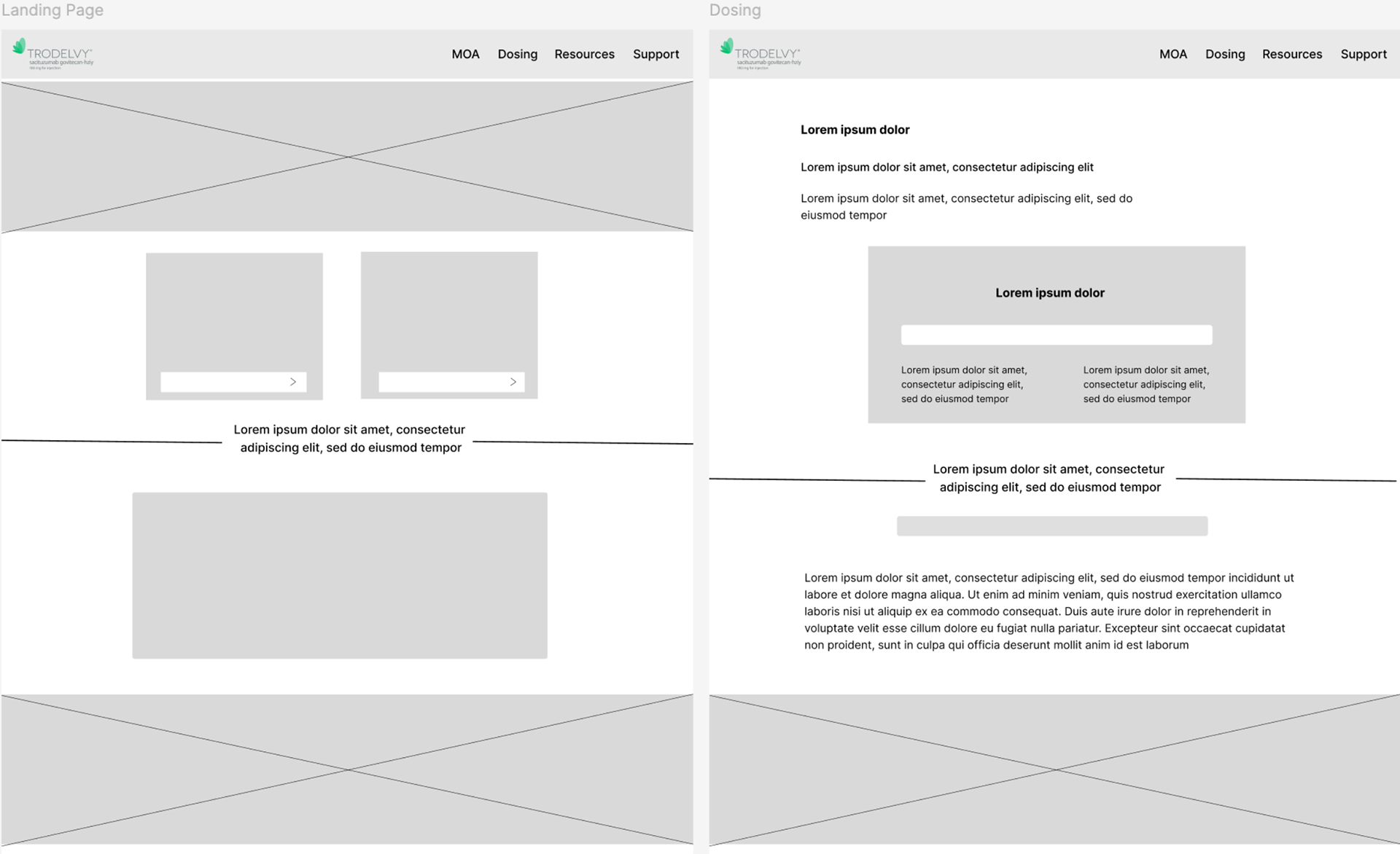
Wireframes
Low-fidelity wireframes created to explore layout, hierarchy, and content flow.
UX Strategy
Based on user behavior insights and project goals, the UX strategy focused on simplifying how users access critical information. I prioritized clearer navigation labels, reduced unnecessary steps in key user journeys, and restructured content into scannable sections. High-value information such as treatment details, FAQs, and support resources were surfaced earlier to better align with user intent. These decisions helped create a more intuitive and patient-focused experience.
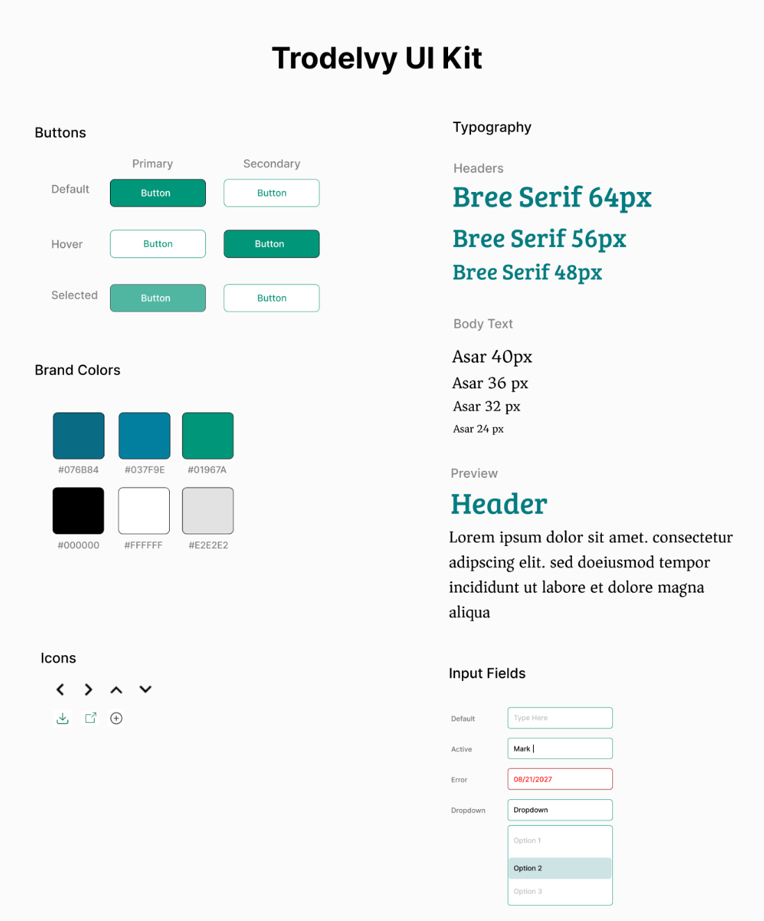
Visual Design Direction
The visual direction was designed to feel trustworthy, calm, and easy to navigate. A restrained color palette was used to establish credibility while subtle accent colors guide attention to key actions. Typography emphasizes readability and hierarchy, making complex information easier to scan and understand. Overall, the design system supports clarity and consistency while allowing content to remain the primary focus.
Accessibility Considerations
Accessibility was an important factor throughout the design process. Layouts were structured with clear hierarchy and consistent spacing to improve readability. Color choices were made with contrast in mind, and typography was sized to support both desktop and mobile viewing. Navigation and content structure were designed to be predictable and easy to follow, supporting a more inclusive experience for all users.
Reflection
This project strengthened my ability to design for complex, high-stakes content where clarity is essential. Working with real user behavior data reinforced the importance of simplifying information and prioritizing user needs over assumptions. If I were to continue iterating, I would explore additional user testing to further validate and refine the experience.
Live Website
The final website was successfully launched and reflects the UX strategy and design decisions outlined in this case study. While some elements evolved during development, the core structure, content hierarchy, and navigation approach remain aligned with the original UX direction.