Overview
This project is a UX audit of a nonprofit website aimed at identifying usability and accessibility issues across key pages. The goal was to evaluate the existing experience, highlight areas of friction, and provide actionable recommendations to improve clarity and navigation without a full redesign.
_______________________________________________________________________________
Audit Goals
- Improve clarity and hierarchy across core pages (Home, Volunteer, Contact)
- Make it easier for users to understand how to get involved
- Reduce friction when users attempt to contact the organization
- Identify accessibility and usability issues that impact trust and engagement
Methodology
The audit was conducted through a qualitative review of the website using UX heuristics and accessibility best practices. Each page was evaluated from the perspective of a first-time visitor seeking to understand the organization’s mission, volunteer opportunities, and contact information.
_______________________________________________________________________________
Key Findings By Page
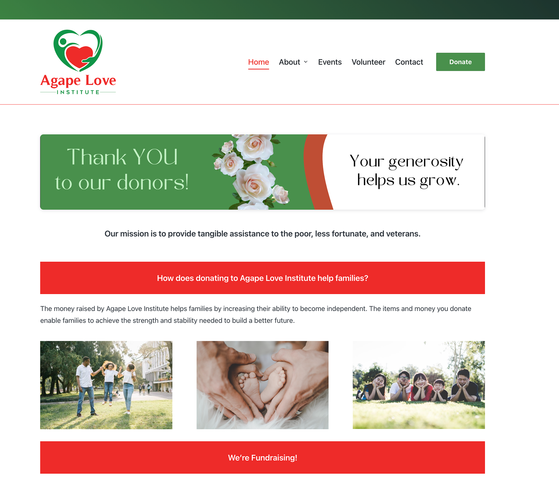
Homepage
Findings:
- The homepage contains multiple content sections with limited visual hierarchy, making it difficult for users to quickly understand the organization’s purpose.
- There is no clear About section near the top of the page, which can leave users unsure what the organization does or who it serves.
- Primary calls to action are not clearly emphasized, increasing the risk that users may miss opportunities to engage.
- Long text sections reduce scannability, especially for users quickly browsing the site.
Recommendation:
Introduce a clear About section near the top of the homepage that succinctly explains who the organization is and what they do. Strengthen hierarchy through clearer headings, increased spacing between sections, and more prominent calls to action to guide users toward meaningful engagement.
Introduce a clear About section near the top of the homepage that succinctly explains who the organization is and what they do. Strengthen hierarchy through clearer headings, increased spacing between sections, and more prominent calls to action to guide users toward meaningful engagement.
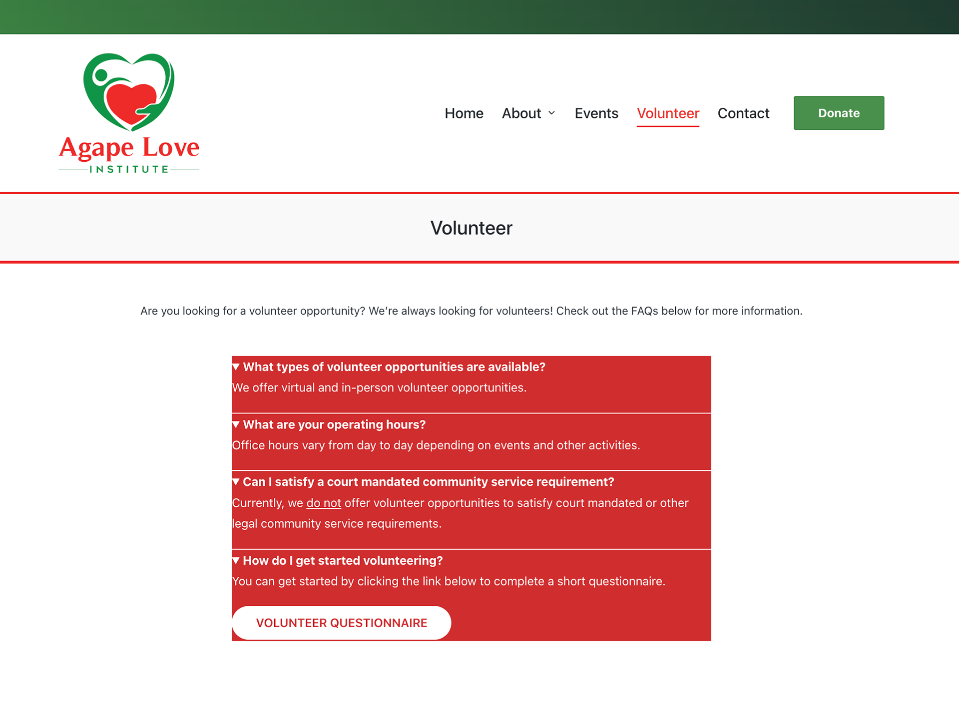
Volunteer Page
Findings:
- The volunteer page is structured as a short FAQ with only a few questions, which limits its effectiveness as a dedicated volunteer resource.
- The Volunteer Questionnaire form is hidden inside the final FAQ dropdown, making it easy for users to miss the primary action.
- Users must expand multiple sections to understand how to get involved, which adds unnecessary friction.
- The page does not clearly communicate volunteering expectations or next steps at a glance.
Recommendation:
The page should be reframed as a volunteer-focused landing page rather than an FAQ. The Volunteer Questionnaire form should be surfaced outside of the dropdowns so the primary action is immediately visible. Clear headings should be used to explain what volunteering involves, outline expectations, and guide users through next steps, while FAQs can remain as a supporting section below the main content.
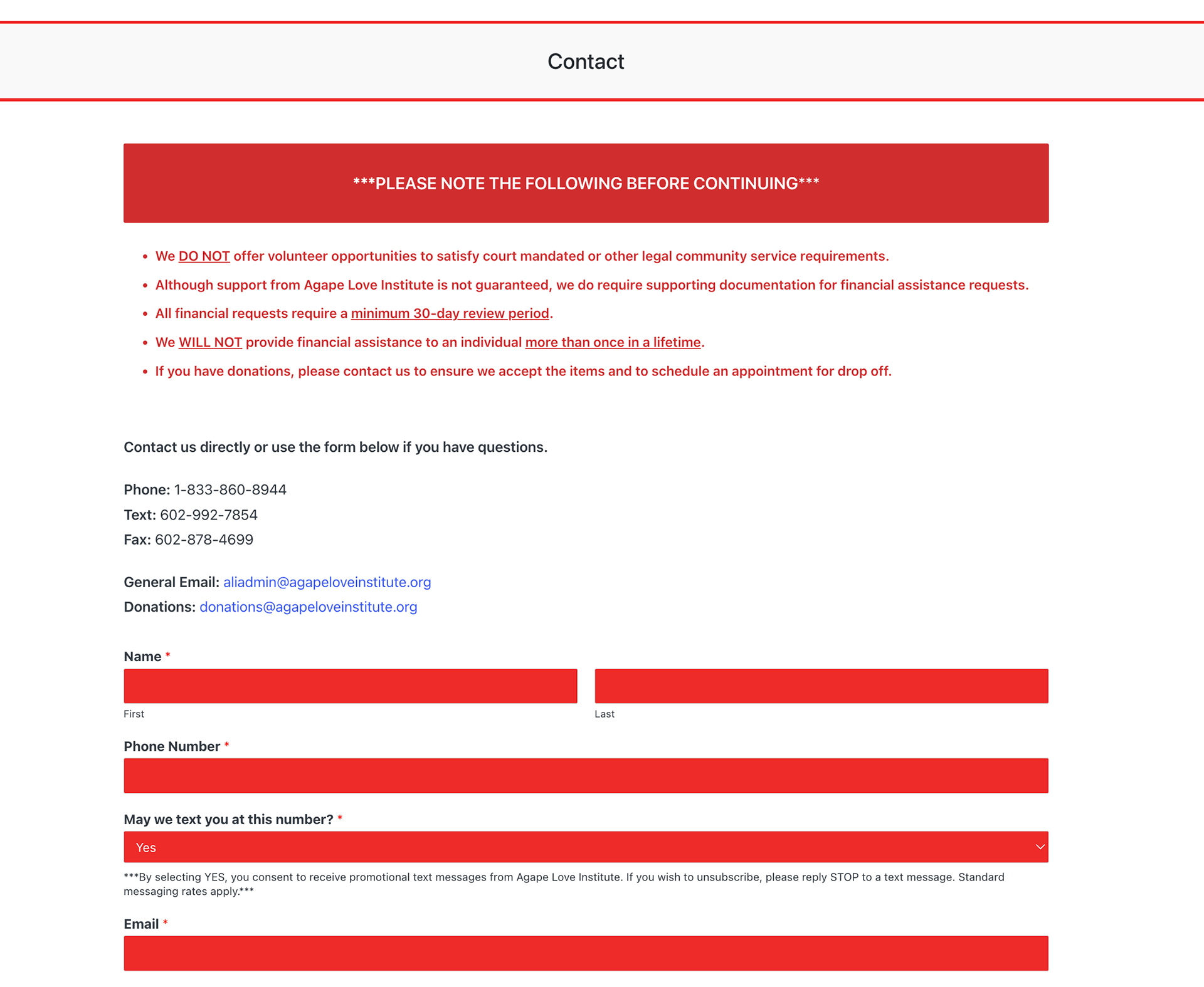
Contact Page
Findings:
- The contact page successfully provides the necessary information, but the overall layout feels visually heavy and could be more engaging.
- Contact information is presented in solid red square boxes, which align with the site’s theme but can feel overwhelming and rigid.
- Informational content appears at the top of the page that may be better suited for an FAQ section rather than the primary contact experience.
- The page lacks visual hierarchy to clearly guide users toward the most common contact method.
Recommendation:
The contact page could be improved by softening the visual presentation while still maintaining the brand’s red theme, such as using lighter backgrounds, rounded elements, or increased spacing to create a more inviting layout. Informational content currently placed at the top of the page should be relocated to the FAQ section to keep the contact page focused on action. Refining hierarchy and layout would help users quickly identify how and where to reach out, creating a clearer and more approachable experience.
UX Recommendations
Based on the audit findings across the homepage, volunteer page, and contact page, the following recommendations focus on improving clarity, usability, and visual hierarchy without requiring a full redesign.
Navigation & Page Structure
Improve page hierarchy by clearly separating content sections, adding consistent headings, and ensuring primary actions are immediately visible. This will help users quickly understand where they are and what to do next.
Improve page hierarchy by clearly separating content sections, adding consistent headings, and ensuring primary actions are immediately visible. This will help users quickly understand where they are and what to do next.
Content Clarity & Wayfinding
Reorganize content to surface key information earlier on each page, particularly on the homepage and volunteer page. Supporting information should be moved to secondary sections such as FAQs to reduce cognitive load.
Reorganize content to surface key information earlier on each page, particularly on the homepage and volunteer page. Supporting information should be moved to secondary sections such as FAQs to reduce cognitive load.
Visual Hierarchy & Readability
Refine layouts by increasing spacing between sections, softening heavy visual elements, and emphasizing calls to action. These changes would make pages easier to scan while maintaining brand consistency.
Refine layouts by increasing spacing between sections, softening heavy visual elements, and emphasizing calls to action. These changes would make pages easier to scan while maintaining brand consistency.
Accessibility Improvements
Adjust layout and structure to prevent content overlap, improve text contrast where needed, and ensure consistent heading structure to support screen readers and keyboard navigation.
Adjust layout and structure to prevent content overlap, improve text contrast where needed, and ensure consistent heading structure to support screen readers and keyboard navigation.
Impact
Implementing these recommendations would improve clarity, usability, and overall visual balance across the site’s key pages. Users would be able to more easily understand the organization’s mission, identify ways to get involved, and contact the organization without unnecessary friction. Small structural and visual improvements can meaningfully increase trust and engagement, especially for nonprofit audiences seeking clear and accessible information.
Reflection
This UX audit reinforced how thoughtful evaluation and small, targeted changes can significantly improve user experience without a full redesign. The project strengthened my ability to identify usability issues, evaluate content structure, and provide actionable recommendations grounded in UX best practices. It also highlighted the importance of designing with clarity and accessibility in mind, particularly for organizations focused on community impact.